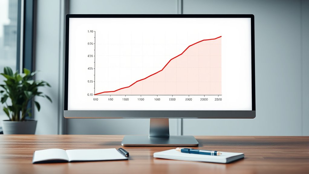
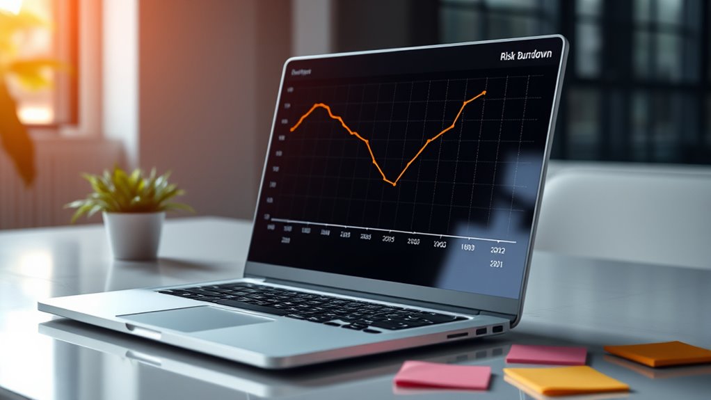
A risk burndown chart visually tracks your project’s risk reduction over time, helping you see how mitigation efforts lower risk exposure toward zero. It allows you to monitor progress, identify potential gaps, and adjust strategies early. By consistently updating the chart, you gain insight into the effectiveness of your risk management, boosting confidence and decision-making. Keep exploring to discover how to create and interpret these charts for maximum impact.
Key Takeaways
- Risk burndown charts visually track risk reduction over time, highlighting mitigation effectiveness.
- They start with total project risk exposure and update regularly to show progress toward zero risk.
- Analyzing chart trends helps identify mitigation gaps, emerging risks, and areas needing attention.
- These charts facilitate communication among teams and stakeholders by demonstrating tangible risk management progress.
- They promote proactive risk management, enabling early intervention and strategic adjustments to minimize hazards.

Risk burndown charts are powerful tools that help you visualize and track the reduction of project risks over time. They give you a clear picture of how well your risk mitigation efforts are working and provide a roadmap toward minimizing hazards. When you use these charts effectively, you can spot potential issues early and adjust your strategies before risks escalate. The visual nature of risk burndown charts makes it easier to communicate progress to your team and stakeholders, ensuring everyone stays aligned on the risk management goals.
Risk burndown charts visually track risk reduction, aiding early issue detection and aligning teams on mitigation progress.
As you implement risk mitigation strategies, hazard tracking becomes a crucial component. You need to identify risks early, assess their potential impact, and prioritize mitigation actions. The chart then acts as a real-time dashboard, reflecting how your efforts are decreasing the overall risk exposure. For example, if you notice certain risks remaining stubborn despite mitigation measures, you can investigate why and refine your approach. This ongoing hazard tracking helps you allocate resources more efficiently, focusing on high-risk areas that need additional attention.
Creating a risk burndown chart involves plotting the total risk exposure at the start of your project and then updating it regularly as risks are addressed. The goal is to see a steady decline, ideally approaching zero as you near project completion. This visual trend provides motivation and clarity — you can see tangible progress even if individual risks fluctuate temporarily. It’s important to examine the reasons behind any plateaus or spikes; perhaps new risks have emerged, or mitigation efforts need reinforcement. Regular updates keep the chart accurate and useful as a decision-making tool.
Using risk burndown charts also encourages a proactive mindset. Instead of waiting for risks to cause problems, you’re continuously monitoring and acting on hazard tracking data. This proactive approach minimizes surprises and helps you stay ahead of potential issues. Over time, you develop a better understanding of how different mitigation strategies influence risk reduction, enabling you to optimize your efforts. Additionally, understanding inspirational quotes about fatherhood and the importance of guidance can remind team members of the value of mentorship and leadership in managing risks effectively.
Ultimately, these charts serve as a visual confirmation that your risk management strategies are working. They motivate your team by showing clear progress, and they provide a straightforward way to communicate risk status to stakeholders. By integrating risk mitigation and hazard tracking into your project management process with a risk burndown chart, you set yourself up for a smoother project journey — one that moves steadily toward reducing risks to zero, or as close as possible. This ongoing visual feedback ensures you stay focused, agile, and informed every step of the way.

PMXBOARD Gantt Chart Project Whiteboard Kit | 668 Magnetic Pieces and Easel | Visual Timeline, Risks & Critical Path Planning | Ultimate Project Management Board for Teams
✔ Ultimate Gantt Chart Project Management Board Kit. Build project timelines, identify critical paths, and manage project risks…
As an affiliate, we earn on qualifying purchases.
As an affiliate, we earn on qualifying purchases.
Frequently Asked Questions
How Do Risk Burndown Charts Differ From Traditional Project Burndown Charts?
You want to understand how risk burndown charts differ from traditional project burndown charts. Unlike traditional charts that track task completion, risk burndown charts focus on risk assessment and how identified risks decrease over time. They help you visualize progress in contingency planning, showing how mitigation efforts reduce risks. This allows you to monitor risks actively, rather than just project tasks, providing a clearer picture of your risk management effectiveness.
What Are the Best Tools for Creating Risk Burndown Charts?
You should explore tools with interactive dashboards and automation features for creating risk burndown charts. Platforms like Jira, Power BI, and Tableau offer customizable dashboards that update automatically, giving you real-time insights. These tools streamline data visualization, making it easier to track risks’ progress toward zero. Automation reduces manual effort, helping you focus on risk mitigation strategies while maintaining clear, dynamic visualizations of your risk management efforts.
How Can Risk Burndown Charts Improve Stakeholder Communication?
You can boost stakeholder engagement and improve communication clarity by using risk burndown charts. These visuals make it easy for stakeholders to see how risks are decreasing over time, fostering transparency. When you regularly update and share the charts, everyone stays informed about progress and potential issues. This proactive approach builds trust, encourages collaboration, and guarantees all stakeholders are aligned, making project risk management more effective and straightforward.
What Challenges Might Teams Face When Implementing Risk Burndown Charts?
When implementing risk burndown charts, you might face challenges like ensuring data accuracy, which is vital for reliable insights. Additionally, team training is essential; if your team isn’t familiar with how to interpret and update these charts, their effectiveness doesn’t reach its potential. You’ll need to invest time in educating your team and establishing clear processes to overcome these hurdles, ensuring the charts support better risk management.
How Often Should Risk Burndown Charts Be Updated During a Project?
Imagine your project as a ship steering treacherous waters. To steer effectively, you need up-to-date maps. Updating your risk burndown charts daily or weekly ensures your risk assessment stays accurate, guiding you safely through potential hazards. Regular updates help catch new risks early and maintain data accuracy, so your team can respond swiftly. Consistent monitoring keeps your project on course, avoiding surprises and ensuring smooth sailing to completion.
risk burndown chart template
As an affiliate, we earn on qualifying purchases.
As an affiliate, we earn on qualifying purchases.
Conclusion
So, next time you’re staring at those risk burndown charts, imagine them as your risk-fighting superhero cape—swooping in to save your project from chaos. As risks diminish, picture your team sipping margaritas on a beach, leaving disaster in the dust. Remember, these charts aren’t just numbers; they’re your secret weapon to conquer chaos and make project threats vanish faster than your last deadline. Risk management just got a lot more glamorous.

PMXBOARD Gantt Chart Project Whiteboard Kit | 668 Magnetic Pieces and Easel | Visual Timeline, Risks & Critical Path Planning | Ultimate Project Management Board for Teams
✔ Ultimate Gantt Chart Project Management Board Kit. Build project timelines, identify critical paths, and manage project risks…
As an affiliate, we earn on qualifying purchases.
As an affiliate, we earn on qualifying purchases.

Habit Tracker Progress Poster by Free Period Press – 11”x17” – Yearly Atomic Habits Tracker for Goals and Projects
Big goals are achieved by making a bit of progress every day. The Progress Tracker helps you track…
As an affiliate, we earn on qualifying purchases.
As an affiliate, we earn on qualifying purchases.


